Photoshop To Illustrator: A Workflow For Textile Artwork
Introduction
On October 2nd, I participated in the FESPA Digital Textile Conference in Milan. 160 attendees from all over the world gathered to listen to presentations whose themes would range from the current market trends to economical analysis, from case studies to production techniques. In July, I had the privilege and the pleasure to be invited as one of the fourteen speakers of the day. Given the nature of the audience, I was looking for some subject that could be of real interest for the textile community, so I proposed the premiere presentation of a technique, later evolved into a proposed workflow, aimed at recovering and manipulating patterns and motifs designed with traditional screen printing in mind, with an eye at the flexibility of the modern digital workflow which is quickly taking over.
FESPA were delighted and gave me carte blanche, so I set to study and refine the proposal. This long article opens it to the public for the first time after my DTC presentation.
The obvious disclaimer is that I have no idea whether my idea is entirely original or not: as I said at the DTC, it is well possible that someone in New Zealand figured out the same path three years ago. All I can say is that a rather deep Google search didn’t show any obvious hint of a similar procedure. The second and most important disclaimer is that while this technique is likely to be reliable, it hasn’t been tested in production yet, although more than one company volunteered to try it out with my assistance, after the presentation. Therefore, this be should considered as a work in progress, an open idea under discussion, which looks promising but might as well be flawed in a subtle way. In other words, you’ve been warned :).
Before I start, I would like to thank Michela Marcantonio and Duncan MacOwan for their trust and hospitality in Milan, and of course all the other speakers. Among them, simply because I’ve spent more time with them, Ron Gilboa of Infotrends, Marc Van Parys from College Ghent, Andreas Skantze of Big Image Systems AB, Rolf Axel Günther of RAGLAB, and the amazing Michael Schmidt, whose portfolio deserves more than a quick look.
Birth Of The Idea
About a year ago I was consulting with a client on some Photoshop techniques. He is a textile printer, but the problems we were discussing were not connected to such field of operation. At some point he opened a document containing the artwork for a fabric. It was quite impressive: almost 11.000 px per side and made exclusively of spot color channels – 14 of them, actually, each one defining a different Pantone spot color. We began to discuss how unfriendly Photoshop’s Multichannel color mode is: it doesn’t allow any layers, and editing is cumbersome. Everything happens through channels: it’s possible, for instance, to change a color into another by redefining the relevant channel, but trying out different combinations interactively in real time is something that can’t be done. He suggested that a new approach to this problem would be more than welcome for designers and printers alike, and he got me thinking.
A few days later, one of the students at the Interior Design course in the institute where I teach got stuck with a certain procedure in Adobe Illustrator and asked for help. It was then that I saw a feeble connection between two seemingly unrelated problems and started to look for a common solution. In a few weeks I figured out a possible way out of the problem proposed by my client, at least for a large category of images which I generally call patterns (definition later). This is restrictive, of course, but still useful because such images are so widespread in the textile business which probably represent the majority of traditional motifs ever used.
The Fast Transitional Lane
Traditional screen printing techniques have been the standard in textile printing for ages. The basic rule is simple: one ink, one color. Inks can of course be combined and there are several variants of the process, but the basic model is that textiles are usually printed with a certain number of spot colors. It’s not uncommon to have ten or more colors hitting the fabric, and the wise man knows that ink interactions are hardly predictable in this case. For this reason, motifs are very often designed without relevant overlaps, as flat areas which carry one well-defined color.
The market is currently moving swiftly to digital printing, a very different system which is showing an amazing rate of growth. Boiling it down to the essential, a digital textile printer is largely a modified ink-jet printer. There are several inks feeding the (often gargantuan) machine, and the favorite format for input is not anymore a long list of spot colors, but some sort of RGB – at least at this moment in history. Spot colors can be easily converted by the RIP which drives the printer, but there’s no strict reason today to work with spot colors if we know that the final product will be produced by a digital printer. RGB is more flexible and allows for reproduction of photographic images, as well as patterns. This is important, because while it’s relatively unlikely that we want to wear the faithful reproduction of a picture of the Hong-Kong skyline on our trousers, the uncountable uses of fabric outside the world of garments often rely on photographic images. Thinking of “textile” as “garment” is a big mistake: fabric is sometimes better than paper, in interior design and special installations. It can be bent, distorted, it can be made elastic, it is light and can be folded, and it’s easily wrapped around 3D objects. Moreover, it can easily be back-lit if we need.
Having said this, we are not interested in this kind of artwork: photographic images won’t do, in our workflow. We will confine ourselves to patterns, where pattern is a very specific animal.
A Pattern Defined
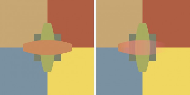
In this context, a pattern is defined as any drawing which can be represented with non-overlapping colors. This also implies that neither gradients nor transparencies are allowed: only areas of flat colors. This is necessary, because there is no way (yet) to efficiently convert anything else than flat colors from raster to vector while maintaining the functionalities we need. So the traditional starting point is a Multichannel file made in Photoshop, with a given number of spot color channels, which we want to process in Illustrator somehow. In each channel, pixels can only exist in two states: fully white or fully black. Tiny overlapping areas are usually not a problem, but this remains a delicate point nevertheless.
As an example, the following image shows an entity which complies to my definition of a pattern (left) and another which doesn’t, because it contains an element which shows both a gradient and transparency.
The Workflow: 1 – The Multichannel PSD Document
The main point of the proposed workflow is easily understood: we want to bring a raster artwork into Illustrator and turn it into a series of vector objects which are easier to handle. There is a problem, though: Illustrator won’t accept a Multichannel document, because only RGB, CMYK, Grayscale and Bitmap color modes are supported. A conversion is therefore necessary somewhere down the line, unless we already have an RGB file. In such case, this step in the workflow is redundant, as well as the second, and we can simply go straight to Step 3 where Illustrator takes control.
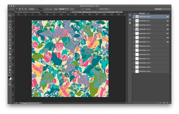
This image shows the artwork I will be using to demonstrate the workflow. Notice the Channels palette: there are fourteen spot color channels, but no regular channel. This file has nothing to do with either RGB, CMYK or Lab.
The Workflow: 2 – The Conversion To RGB
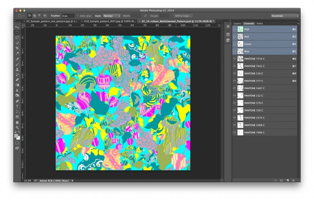
In principle, it is possible to convert a Multichannel file like the one shown to RGB. Unfortunately, the results are useless. The following image shows what happens if one goes Image -> Mode -> RGB:
The reason why the colors undergo such an appalling shift is easily understood by looking at the Channels palette. The first three channels, whatever they represent, are simply interpreted as Red, Green and Blue respectively. The others remain what they are: spot colours, and yet their appearance may change due to the interaction with the three “regular” channels. The final result is something which doesn’t even remotely resemble the original.
A bit of internet surfing shows that the correct technique to convert a Multichannel document to RGB while maintaining the appearance is almost unknown. Some of the proposed solutions are so much up in the realm of human creativity that would deserve an article by themselves. One, for instance, includes taking screenshots at 100% and rebuilding the image from the existing pieces. My solution is this, instead.
- In the Channels palette, create a new channel by clicking on the icon at the bottom of the window.
- The new channel, named Alpha 1, will be created at the bottom of the channels stack. By default it will be black and active.
- With the channel active, go Image -> Adjustments -> Invert. Alpha 1 becomes white.
- Drag Alpha 1 in the top position.
- With Alpha 1 selected, go Image -> Mode -> Grayscale. (Not a joke. Do it.)
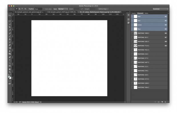
- Still with Alpha 1 selected, go Image -> Mode -> RGB. At this point you’ll be left with a blank document looking like the image below. It doesn’t look promising, but it’s correct. All you have to do is:
- Select all the spot color channels one by one: colors will re-emerge, but the appearance of the artwork will be lighter than the original.
- With all channels active, select Merge Spot Channels from the Channels palette menu.
This will do the trick. The artwork will look identical to the original (unless there are gamut problems, but we’ll suppose there aren’t), but it will be a plain RGB document. Save in your favourite format (remember to embed the color profile!). We’re done with Photoshop.
The Workflow: 3 – Opening The Raster File In Illustrator
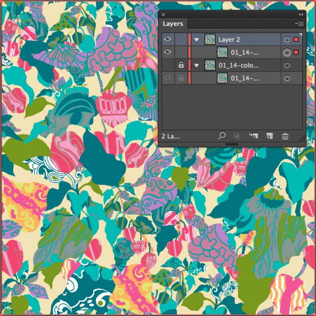
We don’t even need to create an Illustrator document for our artwork: the RGB file can be opened straight away. It won’t become, of course, a vector: we’ll be dealing with a raster image on a layer of an Illustrator document. What we’re going to do next destroys the original raster data, so we will create a new layer, copy and paste the raster object onto it, and then lock the base layer and make it invisible. This will preserve the original artwork for us to make comparisons to the final result when we need to.
The Workflow: 4 – Using Image Trace
This is the most delicate step and the only one which needs real care. At this point we have a raster image which we want to transform into a number of vector objects. We want the appearance to be as close as possible to the original, keeping in mind that minor (and I do mean: minor) differences may not be relevant in this context due to the nature of the output we are considering.
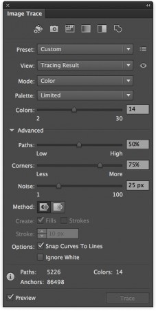
Conversion to vector can be achieved by a function called Image Trace. With the copy of the artwork selected, select View -> Image Trace. The Image Trace window will appear. Change Mode to Color, dial “14” (the number of colors in the current artwork) in the box at the right of the Colors slider, and open the Advanced options. You won’t probably need them as a start, but they may be useful later. Unless you are already sure you need to tweak something else, just click on the Trace button at the bottom.
Illustrator will warn you that you may have to wait, because there are lots of data to be processed. On my MacBook Pro (2.7 GHz Intel Core i7, 16 GB RAM) the whole process took 18 seconds on this big file, so it’s not much of a wait.
At the end of the process this is the appearance of the Image Trace palette. The data at the bottom inform us that more than 5,000 paths were generated, and they’re based on almost 87,000 anchor points. This suggests that we are dealing with a relevant number of vector objects of respectable complexity. Notice also that the number of colors which Illustrator put in the drawing is identical to what we chose to have: fourteen, in this case – the same number as the original spot channels. A check is necessary here: we should make the original artwork visible again, and toggle the top layer on and off while we inspect the vector result for differences. There will certainly be some, or many, but they are often largely irrelevant. In a case like this, a shape which starts bending two pixels away from the original can be considered identical in practice: the printed result will be the same, no matter what we do to prove the opposite. If we’re off by 200 pixels, that’s another story – but this is extremely unlikely in my experience. Comparing a raster to a vector is like comparing apples to pears: the two artworks are different in essence. Yet, we can figure out a strange pear which has the appearance of an apple. As long as the two are visually identical, we’re safe. One should always work with actual resolution in mind, and, of course, some kind of printed proof should be produced. In case you’re satisfied, and you’ll often be, go straight ahead. If you’re not, there are lots of parameters which can be tweaked, and that’s where the Advanced section of the palette comes in handy.
This is not a course on Image Trace, and you should refer to Illustrator’s manual to understand exactly what sliders like Paths, Corners and Noise do, but it’s rather easy to reach an optimal result, even by trial and error. In less than ten minutes you may see ten or more variants of the original artwork and decide to keep what you consider best.
The Workflow: 5 – “Sampling” the colors
The fireworks are about to start. The vector object created by Illustrator is like a suitcase: it contains 5000+ paths, but the paths can’t be accessed individually yet. In order to make them available, we must go Object -> Expand (make sure the object is selected). This will reveal all the individual shapes generated by Image Trace. The artwork will be impossible to look at, because once the command is launched all the paths are revealed (red being the default color). View -> Hide Edges will do what it promises, and the artwork will appear without visible edges.
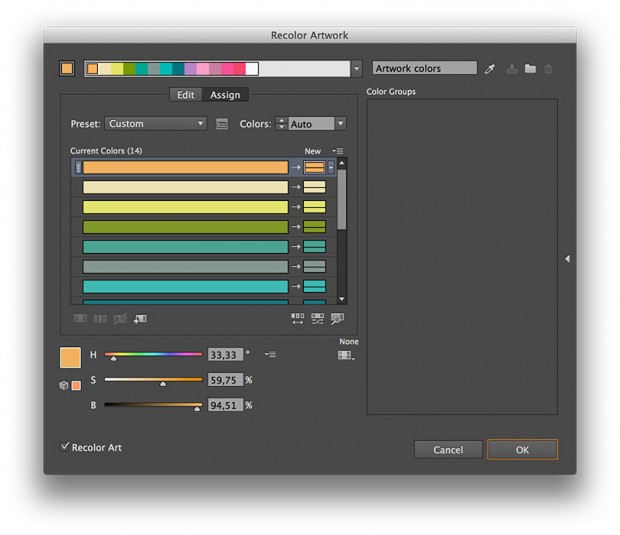
In what follows, the group of objects created by Expand must always be selected. We’re going to use a ridiculously powerful feature of Illustrator known as Recolor Artwork. This is accessible through Edit -> Edit Colors -> Recolor Artwork.
The image shows the window that will pop up when you launch the command. It has two modes: Assign and Edit. The swatches at the top are the colors contained in the artwork; and they are, indeed, the equivalent of the colors defined by the spot color channels in the original Photoshop artwork. This is quite interesting, but nothing compared by what happens when one clicks on Edit.
The Workflow: 6 – Tweak Me Quick
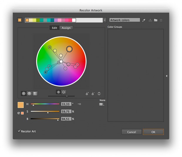
The color wheel that appears when one clicks on the Edit button has a number of vectors stemming from the centre. Each one represents one of the colors in the artwork. These colors can be changed and tweaked at will, either by dragging the heads of the vectors or by entering numbers in the form of HSB in the boxes below. Moreover, sliders are available. The colors can be manipulated together or individually. This is of course a paradise for creative designers: suppose you wonder how the pattern will look when you change a certain orange to blue. Grab the relevant vector (selected in the image above) and drag it towards a certain shade of blue: you’ll see the result in real time, even on a large artwork like this, and you may produce any variation you wish. If something goes wrong, just click on the eyedropper near the top right corner of the window: by doing so, you’ll resample the original colors.
The possibilities are endless and can’t be described in full detail here: but you may choose colors from a library, make variations on hue, saturation or brightness, reduce the number of colors, swap them – in a word, you can do anything.
Designers are not the only ones concerned, though. If you’re printing the pattern, you’re likely to produce a proof which you will use as a reference. Suppose the client is satisfied, but thinks that a certain color, say one of the greens, should be lighter. You can just tweak the color lightly, using the screen as a reference, and produce another proof. If that’s correct, you’re ready for production.
I am not advocating that colors should be corrected by eye: color management exists for some serious reason, and it should be the foundation of any printing process. Common sense, though, suggests that a tweak like the one described makes a lot of sense in the real world. The green being discussed might be one difficult color for the printer; or the profile might simply be inaccurate in that area and the color could be reproduced with a shift. Dan Margulis once suggested a very clear example of what should be done in some cases: if you think the room you’re in is too hot, you’ll want to tweak the temperature of the air conditioning. You don’t care whether the value you read is a certain temperature or another: you simply want fresher air, and you instinctively tweak a knob. If it turns out to be too much, you’ll tweak it in the opposite direction until you’re satisfied. That is, some corrections are qualitative, more than based on numbers, and this is often the case in production. The possibility to tweak an artwork in seconds and produce a proof is invaluable, time-wise, provided that correct color management is used as the basis, of course.
The Workflow: 7 – Ready For Output
Once you’re satisfied with the result, whether it is a creative elaboration or a correction, it is enough to save the Illustrator file as a PDF with the proper parameters. You don’t even need to export a PDF: the .AI native format is extremely similar, to the point that it doesn’t make any difference to Illustrator whether you save as .AI or as a PDF file with proper parameters, so the process is very easy.
In Practice
The following image shows a simple but radical change of color obtained with this workflow. The red of the flowers has been changed into violet simply by grabbing a slider and dragging it where we wanted. It is a very simple and intuitive operation and it doesn’t require any specialized knowledge. It is also, as I explained, just one among many techniques that can be used to change colors. The possible variations are almost infinite, and there is no side effect because all the colors are flat: change one object, change every other object with the same color, without selections and without hassles.
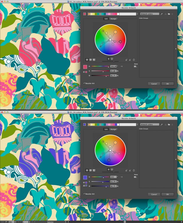
An example of recoloration. The difference between the two examples was obtained simply by dragging one of the original colors onto another in the color wheel.
Doing It The Old Way
This technique can be slightly changed in order to provide a PDF suitable for screen printing as well. We still need an RGB conversion, because Illustrator won’t take multichannel files, but for anyone with average skill it is easy to re-define color samples by means of library colors which will be later exported to PDF as strong colors. The only drawback in this is that Illustrator doesn’t provide a way to automatically approximate a given color with a Pantone (or whatever library) color. Photoshop does, though: it is therefore possibile to write down the values of the swatches in Illustrator, dial them in the Color Picker in Photoshop, call for the closest match with some color defined inside a given a library and write down its code. The colors need then to be defined manually in Illustrator, and imported of course from the same library. It’s a rather ugly workaround, but it can be done. The advantages are, of course, connected to the flexibility of the vector format in a case like this: scalability being probably the first advantage in line.
Final Considerations
Let’s attempt a balance of the pros and cons of this procedure.
Pros:
- Get your older artwork ready for the new devices.
- Tweak colors interactively at will.
- Separately fine-tune colors based on proof.
- Assign global spot colors to samples, if you wish.
Cons:
None known, so far. Just make sure Image Trace works as expected.
This sounds rather promising, to me, less the fact that the technique must be put to the test in a production environment. I will be very glad to receive comments and criticism, as well as remarks on points that I may have overlooked. The whole philosophy behind the workflow is that reinventing the wheel is costly, and if we find something we can use at our advantage in our daily toolbox, that’s just fine.
Again, take this as a work in progress which may lead somewhere; or not. I will try to regularly update the workflow if I find better and simpler ways to do things. But we’re already dealing with a series of steps which adds up to 5 in the best case (RGB raster document as a start) and to 8 in the worst (Multichannel raster document to be prepared for screen printing: the 8th step is that of reassigning the colors, and it falls between the 6th and the 7th step described above). This is not bad, in my view, and it is my hope that the procedure can be refined and improved.
Thanks for reading up to here and, of course, feel free to comment!
Tags: Illustrator, multichannel, recolor, textile, vector
Trackback from your site.

