Russell’s Teapot and Photoshop | 0
One man, millions of ideas
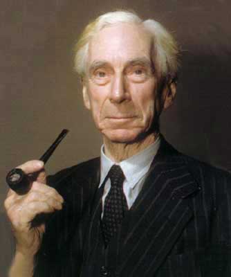
Does anyone remember Bertrand Russell? He’s always been one of my heroes because he was not afraid of doubt. Philosopher, logician, author of the Principia Mathematica with Alfred North Whitehead, Nobel Prize for literature at the age of 78: “in recognition of his varied and significant writings in which he champions humanitarian ideals and freedom of thought”. His well-known antinomy known as Russell’s Paradox shook the foundations of mathematics and started ramifications which are maybe not yet fully understood (it is enough to mention the two incompletness theorems stated by Kurt Gödel in order to solve the problem). He died in 1970, aged 97, so he didn’t live long enough to know Photoshop. Yet I think that if he were alive he would have something to say on some preconceptions which cross our field, and he would whip into place several wrong ideas we’ve been living with for too long.
Not a blogpost, but a series
This post is #0 of a series called “Russell’s Teapot and Photoshop”, in memory of a famous article commissioned to the author in 1952. The teapot story is a true manifesto of freedom of thought and I would like to resume it here.
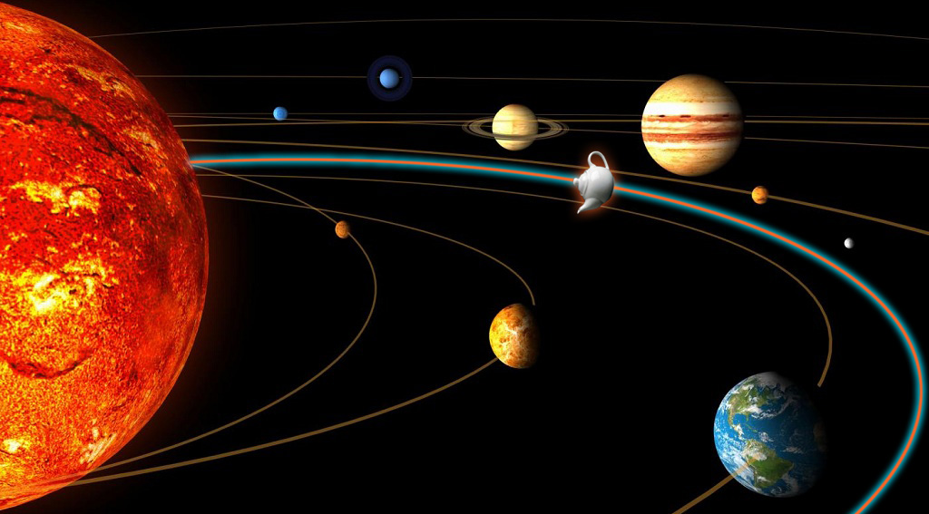
Plug-in alert! Unidentified Flying Teapot in orbit between Earth and Mars.
Russell states that the existence of a china teapot located between Earth and Mars and revolving around the Sun is impossible to deny: unless we add that the teapot is too small to be revealed, with any telescope. This makes sound sense: one can’t deny the existence of something that can’t be observed. Russell then warns about a possible next step, far too easy to foresee:
But if I were to go on to say that, since my assertion cannot be disproved, it is intolerable presumption on the part of human reason to doubt it, I should rightly be thought to be talking nonsense. If, however, the existence of such a teapot were affirmed in ancient books, taught as the sacred truth every Sunday, and instilled into the minds of children at school, hesitation to believe in its existence would become a mark of eccentricity and entitle the doubter to the attentions of the psychiatrist in an enlightened age or of the Inquisitor in an earlier time.
A bang on the head of any integralism, then: of any sign.
A fundamental postulate
Why do I like this teapot so much? Because, in this series of articles, I would love to discuss in realistic terms some prejudices which marr the subjects we’re interested in. I will announce the subjects as the articles appear, and in this first post I would like to introduce some concepts to which I will refer in the future. You will need to be patient, at least this time, because I need to set up a small playground which can host the subjects we’re going to discuss. I’d love to start from a fundamental postulate. Like any postulete, this can be of course denied and you’re free to do it; I only would like it to be clear and I will constantly refer to this idea. My postulate is the following.
Two images which are indistinguishable by an average human observer can be considered equal independently from any difference which can be found with other methods of proof.
This postulate has two very important implications.
- If we find any matematical difference in the numbers which define the two images, but such difference can’t produce any visible effect, we’ll declare such difference irrelevant.
- A difference found by an instrument which, again, is invisible to a human being will be as well considered irrelevant.

Creationists: I respect you, but I believe this is my dad.
The logic of such implications is not to deny theory or consider instrumental readings irrelevant: these are two extremely important sides of our work. It rather points at the effort to bring on the scene a pratical approach which is based on sense: the operations we perform on our images and on the images of our clients yield results which will be enjoyed by our peers – genus Homo, species Homo Sapiens Sapiens, straightforward descendents of the Australopithecus Africanus. This descendency is important, because it implies that while we’re all different from each other we share a huge number of things: among these, perception. If we believe in the postulate above, everything that can improve our work on images is welcome; but we should pay attention to prejudices an preconceptions, often sold as truths of faith, which can actually compromise our work, or anyway prevent us to bring it to the maximum quality level possible.
A truly boring example
I’d like to give an example of what I mean, and I will choose it blatant enough that it may be potentially offensive to intelligence, just in order to clear up the concept. Let’s open an image in Photoshop and set the Zoom factor at maximum level: 3,200%. This allows us to see each single pixel as a square. Let’s start from the left top angle and move exactly 500 pixel horizontally and vertically. Sample the pixel we’ve found with the Eyerdropper set for once to Sample point. The RGB coordinates of such pixel in the color space of the image (ProPhoto RGB, 8-bit) are 119R129G166B. Now let’s set a new foreground color via the Color Selector. We’ll make it 121R131G168B, by stepping up each RGB components by two points. With the Pencil tool, size 1px, let’s change the color of the previously examined pixel. Question: is now the image different from the previous one? From a strictly mathematical point of view, yes: it is different in one point and therefore can’t be considered identical. Perceptually, no. Mind you – if we create a document and fill it with the original color of the pixel, 119R129G166B, and change the color in a single pixel by using the new coordinates, we can spot the difference on a good monitor. I’ve tried: it is visible! But this happens with a synthetic image, no matter how simple. Can we see it in a photograph? Never in a million years: because the pixels surrounding the one we chose happily change by similar and even larger quantities than the variation I created. That is, there is noise: it’s very small, to the point of being invisible, but it is noise: a random fluctuation. On the other hand, since I am not showing you the image, you may wonder how noisy it really is. Righteous question.
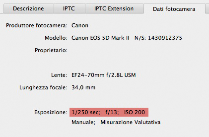
Is this picture likely to be noisy?
The first answer I may give is in the screenshot of the data contained in the File info panel I’ve opened (in the picture – in Italian). A camera like this, set on ISO 200, with an exposure of 1/250th of a second doesn’t normally produce a very noisy file. But this is, of course, an empirical consideration which doesn’t prove anything. Let’s try something else: let’s select a significantly large area around the pixel chosen for variation which is exactly in the center of the square selection visible in the next image. You may click on it to see it enlarged. Notice that all the images in this article were converted to sRGB for the web, so if you try you will find different numbers than the ones written here.

Anyone can see the modified pixel?
Before doing something that will be discussed shortly, let’s try and find the modified pixel. You may have guessed that this enormously enlarged detail of the image is that of a blue sky. Where is the pixel? It’s exactly at the center of the selection, but don’t count the squares: try to see if you can see a significantly different pixel by naked eye. Obviously, the answer is no. Now, the selection is 29 x 29 px, so it has 841 px in total. Filter -> Blur -> Average: the whole selected area is filled by a flat color which is the average of all the pixel contained in the selection: 120R130G167B, right between the two colors cited before – the one of the original pixel and the one chosen for substitution.
Hunting for differences
Again: which pixel did I change?
If we examine the averaged area and the original pixel by pixel we obviously discover that the numbers are different. It’s an easy observation: just stack the two images so that they are perfectly aligned in Difference blend mode, and read the difference values in the Info panel. If we amplify the differences enormously we obtain the random pattern visibile in the image. It is random because there is no regular scheme: we’re looking at amplified noise, and this kind of noise is a random phenomenon. The colors reveal which channels underwent the maximum variation between the two images but the essential fact is this: the black pixels correspond to no variation, the white ones to maximum variation. Outside the selection, all the pixels are black because there is no difference at all between the images: the average was computed only inside the square area. Inside, everything can happen. But again: now that we can see the differences clearly, can we spot the originally modified pixel? No, because of the random nature of the pattern. If you’re curious, I can bring you there without counting: the pixel in question is navy blu and surrounded by four pixels with this aspect: North, magenta; East, violet; South, dark yellow; West: identical navy blue. Can you see it now? With some effort you’ve probably found it. But the hope to spot it without any hint, even looking at the differences, is a flat zero.
But is this useful?
This is not a self-referential analysis. We pointed our attention on one single pixel to show that certain differences are completely irrelevant in the global context of images. My decision to use ProPhoto RGB had a reason: it is the color space with the widest gamut among the standard RGB working spaces which are normally used. I’ve chosen it because its chromatic extension is huge, but it has the self-same number of colors as sRGB, Adobe RGB or any other RGB color space: in 8-bit, 16,777,216 colors. Same number of colored cubes, but huge size: this means that when we step from a cube onto another the variation is larger than in a color space with a smaller gamut. If the effect is invisible in ProPhoto RGB, it won’t be visible in smaller color spaces.
If all this is unclear, let’s have a look at the following series of samples.

Samples of colors varying by two points in each channel. Above, sRGB; below, ProPhoto RGB.
My starting point was 150R30G20Bin sRGB. This is the upper square to the left. The following nine squares were filled with colors which progressively change by two points in each channel: 152R32G22B, 154R34G24B and so forth. Then, in another file, this time in ProPhoto RGB, I computed the equivalent of the first color: 94R44G23B, and I’ve done exactly the same.In the end, conversion from ProPhoto RGB to sRGB and coupling of the two scales (ProPhoto is below, in the image). A very obvious result: the variation in ProPhoto RGB, by taking the same steps taken in sRGB, is much larger because of what I explained above.
From one pixel to all pixels
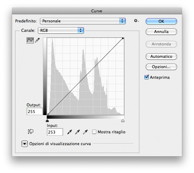
A composite curve in RGB. The lower left points goes two units left, the upper right goes left by the same amount.
The point I’d like to make with my example is simple: in some cases a mathematical difference exists, but it can’t be perceived. According to the postulate, then, it can be considered as non-existent. I think the objection could be that I’ve worked on one single pixel in an image whose size is 5442 x 3628, so it’s one out of almost 20 millions: it can’t possibly be seen in the whole image. What I want to do now is change all or at least the majority of pixels in an image. I will do it with the global contrast curve visibile in the figure: the lowest left point, in the shadows, is moved two units towards the right: Input = 2, Output = 0. The upper right point undergoes a similar treatment: Input = 253, Output = 255. The original image is the first below; the next one is the same image after the curve. Before being converted for the web the two images were in ProPhoto RGB.
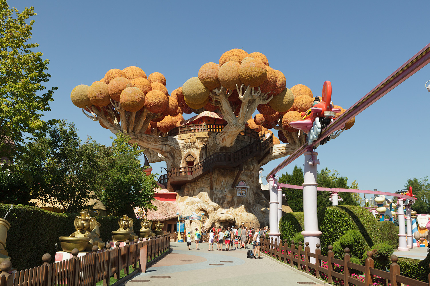
The original image as developed in Adobe Camera Raw.
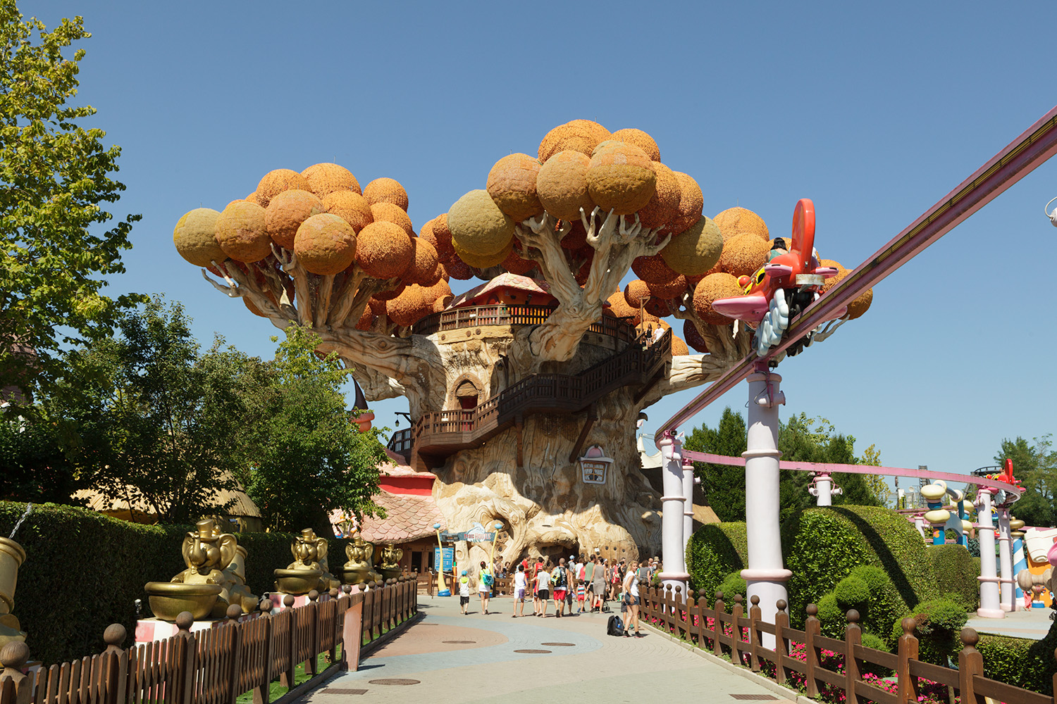
The image after the curve. Is it different?
The question is whether the two images look different. Even checking side by side at maximum resolution my answer is: no. Five more people examined them and their reply is again: no. Possibly someone exceptionally sensitive to contrast, luminosity and color could see a minimal difference, but I have doubts. If you wish to try, please pay attention that a monitor is locally inhomogeneous and often even identical images, when paired, may look different. If you saw that one is lighter, or has more contrast, or is in any way different, try swapping them, or overlay them in sequence, and so on, so that you’re certain about what you see.
If we found someone able to spot an obvious difference, we should accept to be at the margin of my postulate, but the statistical weight of this exceptional sensitivity would be small nevertheless: the majority of people would still be unable to decide which image is which. Moreover, even if it was possible to find an area where the difference could be visible at huge magnification, this would be almost irrelevant because the image makes sense when it is seen as a whole; or even cropped, but the difference between very few pixels in a specific microscopic area wouldn’t be different. When we are closely watching the pixels, we aren’t seeing any image, just like a pine’s needles won’t tell us nothing about the forest, meant as the entity where the pine lives.
A detail of the image enlarged at 700%. These are about 32.000 pixels: what if we change one, as we did before?
In fact the last objection is weak from the start because, after the discussion of a change in a single pixel in the sky, such difference couldn’t be visible in any way. A different pixel can be seen, with some trouble, if it’s surrounded by strictly identical pixels: anything inhomogeneous jumps out when the rest is strictly homogeneous. But no significant area in a photographic image is formed by strictly identical pixels. The sky is the most homogeneous extended part of our image, and above we see another enlarged area with a zoom factor of 700%. There are more than 30,000 pixels at play and the variations are a lot larger than in the sky: by changing one pixel only, as we did before, we would stand less chances to see it, because the micro-variation would be choked by a global variation a lot larger than any realistically conceivable noise. Moreover, a variation which describes real shapes, not random.
Differences everywhere, but…
At this point, as before, let’s have a look at the difference between the original image and the curved version. The maximum variation in each pixel is 2R2G2B, exactly the same variation induced in the experiment on the pixel in the sky. The variation map, at ridiculous amplitude magnification is the following:
The variation map between the two treated images, amplified by a factor of 128.
In the neutral areas, the variation changes luminosity. Colored areas indicate a color shift instead. We don’t have one different pixel, here: the striking majority of pixels has been changed; also, variations are not random, because we can easily distinguish the edges of objects. Yet we can’t perceive any difference between the original and the curved version, so the postulate asks us to consider the two images equal at least for those of us descending from a tribe of evolved monkeys. The Info Panel, of course, doesn’t have primates in its genealogy. For this reason, what the computer says is practically irrelevant: as long as nobody can certainly and regularly pick the curved version when it is paired to the riginal, the discussino on difference is useless. In the same way, if it was possible to see the difference, we would have one chance only: declare we are falling outside the postulate; or declare that the postulate is wrong and must be abandoned. So science goes, and so common sense should go as well.
JND, who was he?
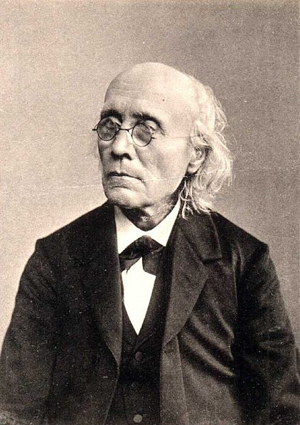
Gustav Theodor Fechner, one of the fathers of psychophysics.
Gustav Theodor Fechner, lived in the 19th century, was one of the fathers ofpsychophysics. Even though the weight of his ideas lost some momentum along the way, some of them still have a basic importance in the study of perception-related phenomena. In particular, the concept of Just-noticeable difference (JND), is as fundamental as it is simple: if we receive a stimulus causing a perception (reference stimulus) and a subsequent stimulus which is a variation of the first (secondary stimulus), the ratio between the intensity of the variation and the intensity of the reference stimulus is approximately constant. In simpler words, if we apply a curve to an image and it doesn’t cause a significant variation, we are under the JND threshold and no difference can be perceived. This law is known as Weber-Fechner’s law, and it has fallbacks on physics, psychology and even economics.
This is the basis which this series of articles will spring from. The postulate cited at the beginning is based on the observation that a JND exists and is described by the cited law. Russell would probably conclude that when the teapot cannot be observed because it’s too small, the statement that it doesn’t exist has the same value as the opposite statement. We are not discussing the abstract existence of something, here, but the practical relevance of its existence: because the difference maps show that a variation exists, of course, but the experience shows that it is imperceptible, because it stays under the JND for the senses we use to perceve it.
The final meditation is this: if a teapot exists but doesn’t cause any perceptible effect on reality, does it really make sense to waste time being worried about it only because a machine says it exists? Most important: does it make sense to attack those who dare argue that if the teapot didn’t exist things would be exactly identical, in our world?
Thanks for your patience in following my long theoretical ramblings. In the next article, I promise, there will be a lot of tea in the teapot, and we’ll have something important to reason about.
Happy afternoon tea to all!
MO
Tags: fechner, jnd, prejudice, russell, teapot
Trackback from your site.
Comments (2)
Paul
| #
Very interesting beginning, especially for me. When I first looked at the Gardaland images I wondered what you were talking about as I could easily see a brightness difference in the shadows. To be sure I took both images into PS as layers and, as will come as no surprise to you, there was no discernible difference. Even in difference blend mode, nothing but a pure black screen.
Returning to the blog, I moved the top image down one click at a time with my scroll wheel and of course the top image gradually became brighter. My screen is vertical so I learned I have a brightness gradient between the top and bottom of my calibrated monitor. Ouch!
Reply
MO
| #
Many thanks, Paul! I have the same issue on my iMac, so I am aware of the lurking problem.
By the way, best compliments for posting the first comment ever on this newborn blog! 🙂
Reply