
Till Death Do Us Part
I was uncertain whether this post should have the title I gave it or “Till Gray Do Us Part”. I’ve chosen the standard formula to echo the Italian version: “Questi, che mai da me non fia diviso”. That is Dante’s Inferno, of course. But, really, I am going to discuss an aspect of Lab which is very well known but, I suspect, sometimes ill-understood. Moreover, I’ve drawn the conclusion that gray couldn’t really part anything, because it only represents equilibrium instead – but before you call 911 I suggest you to read on.
Some questions are more useful than others to check if a concept has been grasped. In my workshops and classes one of the fundamental ones is this: “how many color primaries does Lab have?” A relevant majority of people replies: four. They think – green, magenta, blue, yellow. But that’s the wrong answer: they’re two. Green-magenta and blue-yellow, to serve you.

A pan scale as a model for the a and b channels.
It is difficult to imagine a two-sided color, even more when the two sides are defined as “opponent”. In RGB, for instance, you have red, green and blue, whatever these terms mean (they depend on chromaticity). They’re different, but opposition is not on the menu. As a physicist, I believe that a simple model can go a longer way than equations when it comes to explaining concepts, and I’ve used a few to explain the difficult idea that colors may come in pairs. One of the most obvious is that of a pan scale: given that the two chromatic channels of Lab (namely “a” and “b”) measure the tendency of a color towards green or magenta (a), or towards blue or yellow (b) and define neutrality as no tendency towards any color, a scale may seem fit. Indeed, it is useful: also because the initially weird character of the a and b channels which allows them to be either negative or positive, differently than RGB or CMYK channels, is easy to visualize. If the left pan goes down, it is negative; if the right pan goes down, it is positive.
There is a subtle problem in this model, though: both pans are always visible together. This is not what happens in Lab: if, say, a color is biased towards magenta in the a channel (a > 0), then the green component is AWOL. You can’t have a > 0 and a < 0 at the same time, that is, you can’t see both pans at once. Enter another model then: my favourite way to explain how the a and b channels work is now based on an even simpler concept than a scale. That is, a coin.
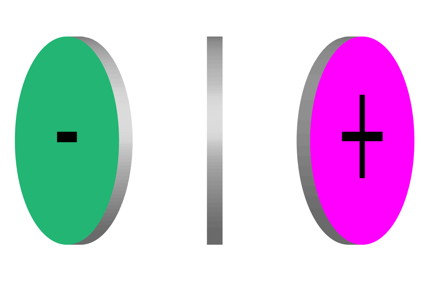
Three of a perfect pair.
This model can be checked very simply: reach out for the nearest coin you can find and see for yourself. No matter how you try, you can never see both sides of a coin: the closest you can get is to look at the border, which means you’re not actually seeing any side. Any way you turn the coin, you’ll only be seeing one side – or no side at all. The figure is self-explanatory, I guess. This coin represents the a channel, and the b channel would be identical, with green substituted by blue and magenta by yellow. One side is green; the other side is magenta; the border is neither green nor magenta. Moreover, the more you rotate the coin around its axis, the more color you see, which sort of accounts for saturation. I’ve thrown in a minus and a plus sign to remind that cold colors (green, blue) are expressed by negative numbers and warm colors (magenta, yellow) belong to the realm of positive numbers.
This model also accounts for the fact that you can’t really go from one color to its opponent without crossing neutrality first: if you’re watching the green side of the coin, you must necessarily turn it in order to see the magenta side; and by doing so you necessarily have to face the border.
One final remark is this. There is scientific truth and there are suggestive models. Sometimes models can be stretched to the point that they break into philosophy rather than science, and color is certainly one of the fields where this temptation is higher. It is a matter of fact that the more one thinks about color, the more dualistic his mind becomes: simultaneous contrast, for instance, is easily perceived as a fundamental aspect of perception – and not only in the field of color. Take temperature for instance: what do words like “cold” and “warm” mean? You may perceive water as cold or warm depending on a number of factors, including whether your hands were dipped in warm(er) or cold(er) water until a few seconds before. The fact is that temperature, as a physical phenomenon, doesn’t account for warmth or cold: connected as it is to molecular motion, it simply measures a certain form of energy available in matter. That we perceive something as “warm” or “cold” is entirely up to a number of conditions which are not as objective as we may think, and the phenomenon is entirely depending upon our perception – something we take for granted but which is, instead, a really complex and often confusing beast.
In my mind, and regardless whether this is scientifically kosher or not, I find it easy and fascinating to think of opponent colors as one single color which may reveal itself in two totally different fashions. I don’t think of magenta as divided from green, but I think of green-magenta showing itself in a certain way depending on its position with respect to something that we call “neutrality”, which is as evanescent a concept as any other. Even not taking temporary and subjective conditions into account, we perceive water as “cold” or “warm” mostly in relation to our body temperature: anything having a significantly higher temperature than ourselves will feel on the “warm” side; go lower, and here comes the “cold”. But temperature is temperature; and, in Lab, a is a. My skin is not biased towards magenta: it is more biased towards magenta than towards green, and if I claim that it has a “magenta component”, or that it must be “positive in the a channel”, it is only because I am using a shortcut to make things simpler.
It is also interesting to consider that the odd man out in this game, the L channel, is not so much different in the end. It gives no lightness when its value is 0, and maximum lightness when it is 100. A value of 50, again sitting right in the middle of the scale, defines an equilibrium point where lightness is equally biased towards 0 and 100. And in fact, 50% gray in Lab is 50L0a0b. Could it be that this middle value for L behaves similarly to what 0 does for a and b? Aren’t “black” and “white” opponent colors in their own right? We’ll discuss this further, one day.
Turn it as you like, as your coin: the idea of two opponent entities which are only apparently so, because they are One, is fascinating. The title of this article therefore seems apt: the formula is rethoric, I hear you say; but it takes more than ordinary love to become inseparable. Ordinary love can be shattered into pieces by the lightest wind; but if you attempt to separate something so deeply connected as the unity of opponents, the result is: fail. Go ahead, and all you’re left with is a totally broken system which won’t be worth its salt. I can quite imagine green saying to magenta: “I can’t fight you anymore – it’s you I’m fighting for”. I am stealing this sentence from U2 and their song Ordinary Love, which I suspect has more to do with color (and our lives) than we would like to admit. Have a go at the idea, yourself, and you may see new worlds opening up.
As you may surmise, I haven’t got the faintest interest in ordinary love, but I am deeply interested in unity, and the dualism springing from it. The bad side of this is that you may be condemned to see more posts along these lines if you come around to see this blog, and I am not quite sure this is the best way to preserve your mental health… 😉
All the best – and be opponent!
MO
Tags: lab, model, opponent colors, perception, u2
Trackback from your site.
Comments (5)
Dario Giannobile
| #
Hi Marco, thanks for this article, well written and simple. Whoever has read the DM’s books already is familiar to this concept. He always speaks in such terms…but truly speaking, i must admit i understood it much later. This will help t fix the concept!
Dario
Reply
Antonio Vitone
| #
Stay opponent, keep turning the wheel. 😉
Reply
Antonio Vitone
| #
So, thinking of opponent colors as one single color leads me to consider there is no mistake in order to CC, just as a reflected reality of coin; that’s means what I’m watching is the coin and his double at the same time! Accepting the duality of things is the first step to unity? Wow! Borges was right about the mirror!
Sorry, Marco, I’m starting to show up my insanity…
Reply
Sandro Franchi
| #
Thanks a lot Marco for the article, absolutely simple and clear, I’ll point my students to it in order to have such clear explanation of this matter. And sorry, but I just learned a new way to explain this so I’ll be using it (and crediting the author as I always do) in my next class 🙂
Reply
Questi, che mai da me non fia diviso | Marco Olivotto
| #
[…] post prende il titolo, naturalmente, dall’Inferno di Dante ed è la traduzione della versione inglese dell’articolo pubblicato su moonphotoshop.com qualche giorno fa. Il suo scopo è quello di […]
Reply