
Which Color Is The Red Planet?
(This article was originally released on marcoolivotto.com on September 9, 2012. It was the first article I wrote in English for that blog.)
So… a new start!
All the original articles in this blog were originally written in Italian, yet I received enough requests to translate them into English that I decided to oblige. I start from this article which, curiously, was the most impromptu article I ever wrote: someone posted something in the CCC – Color Correction Campus group on facebook and when I saw it I went into Auto Write mode. The whole thing was written in less than a couple of hours. If you’re interested in what it is about, read on.
About a month ago, namely on the 6th of August, the vehicle called Curiosity Rover (AKA MSL – Mars Science Laboratory) landed on Mars after a trip of about eight months. Among the scientific equipment it carries, the vehicle sports MastCam, an image capturing system which is actually formed by two cameras able to produce stereoscopic views. Dario Giannobile made a post on the CCC facebook group, pointing to an article which undoubtedly contains a reference to an operation of color correction performed on an image (in color) sent to the Earth by the Curiosity Rover.
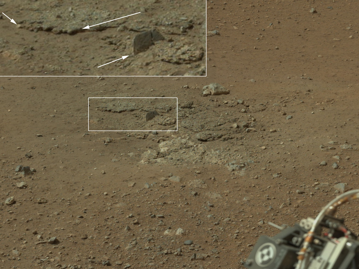
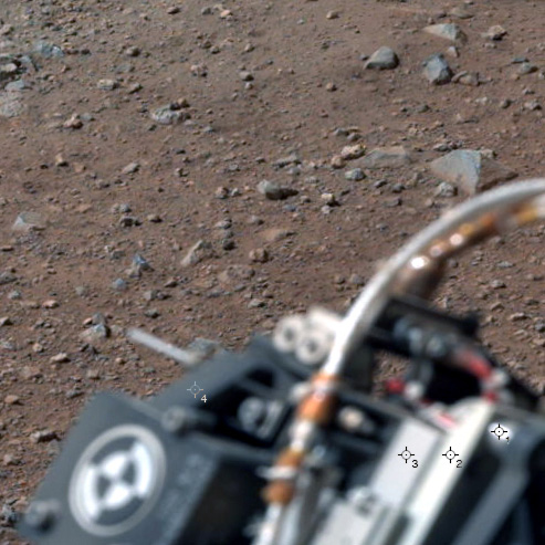
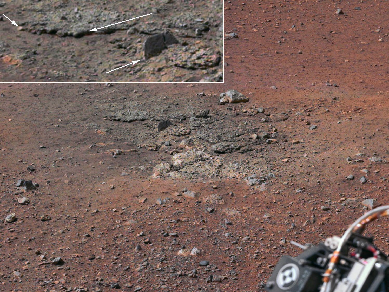
One of the color photographs sent by MSL to the Earth.
The image is public domain and freely downloadable so we can show it here. If you want to see the original at the highest resolution available, it is here. The image shows the debris in an area excavated by the blasts of the descent stage rocket engines. The debris are aptly outlined and enlarged in the upper left area. The most interesting thing for us, though, is the final section of the short article which comments the picture. Keeping in mind that there are two versions of the image available (and we’ll get to the second in a while), here’s the relevant passage:
In the main version, the colors portrayed are unmodified from those returned by the camera. The view is what a cell phone or camcorder would record since the Mastcam takes color pictures in the exact same manner that consumer cameras acquire color images. The second version, linked to the main version, shows the colors modified as if the scene were transported to Earth and illuminated by terrestrial sunlight. This processing, called “white balancing,” is useful for scientists to be able to recognize and distinguish rocks by color in more familiar lighting.
As soon as I had read this passage I started asking myself a few questions. For a start, let’s have a look at the “white balanced” version of the same image shown above. Again, if you want to download it at the maximum resolution available, you can find it here.

Instinctively, one may suspect the original has a yellow cast, and it’s a matter of fact that this version appears more balanced as far as colors are concerned. Notice how the contrast was artificially boosted in the top left enlarged section, in order to enhance the details, and notice also the color shift with respect to the same area contained in the smaller rectangle (this is a typical pheomenon when an adjustment like Auto Tone is applied). My question yet was: if we only had the original version available, what could be said on color? It doesn’t look like we have many known references, because it is true that we call Mars “the Red Planet”, but this is not enough to state that every rock visible on its surface should be red; and even if this were true, how much red should it be? and which hue of red? I therefore tried to face the problem from the most possible neutral point of view, trusting the old adage: every image has a light point and a shadow point, which we tend to represent as white and black, respectively. By “white” and “black” we mean neutral colors, as usual, very light and very dark, respectively.
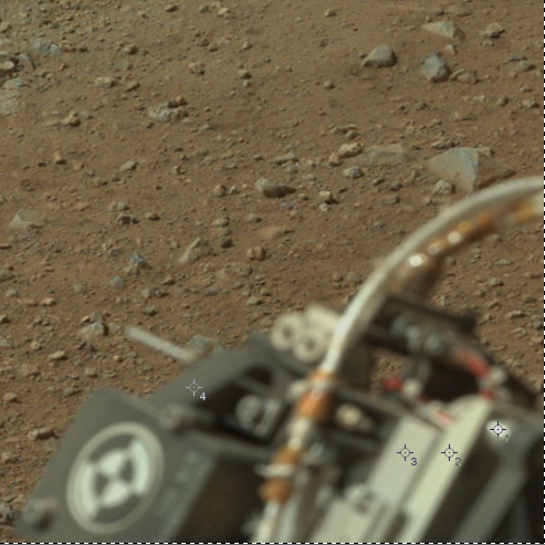
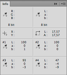
Some significant points on the original image.
Thus, canonical approach: on the original, let’s use the Threshold adjustment in order to identify not the lightest significant point, but the lightest point of all. There are two, and they’re equivalent: the light area visible around mid-height on the right, on what seems to be a pipe of the Curiosity Rover, has the same luminosity of the one we chose (color sampler #1). The Lab values of the chosen point are 87L(2)a1b: apart from a feeble deviation towards green and yellow we can safely state that it is substantially neutral; the lightness value is too low for a highlight, but this is of little interest at this stage. So I added three more color samplers (the maximum number available in Photoshop is four) in areas which I consider significant for luminosity, and these are visible in the image, as well. The figure below shows the Lab readings of the four samplers together.
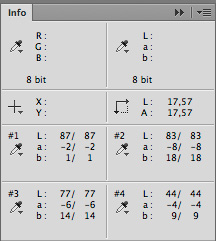
The readouts of the four color samplers in the Info Palette.
The first was already discussed. The others show a clear tendency: a strong green component (a < 0) and a stronger yellow component (b > 0) which tend to drop as lightness decreases. You may ask yourself why I chose an out-of-focus area which is not very significant in the image for my analysis: the reason is quite simple. While I have no idea which colors exactly are the stones on Mars, I may be able to make an educated guess on the color of the terrestrial metals used to build the vehicle. What we see in the area under exam is indeed a part of Curiosity Rover. There is no shortage of official images of it: one, for instance, is available here, and it’s a very significant image to us. Let’s see why.
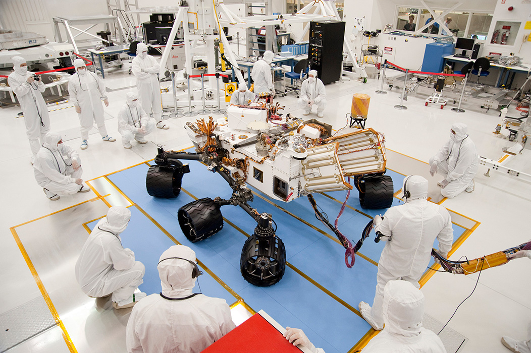
An official image of Curiosity Rover being built.
I’ve got very few certainties in life, but one of these is about the colors in the image to the left. There is a number of either white or neutral objects in this image, and each one of them has a slight yellow cast (roughly, 2 to 5 positive points in the b channel): this means that the image has a slight uniform yellow cast – that is, the cast doesn’t change with luminosity. In other words, this picture doesn’t show a yellow cast in the highlights, almost neutral halftones and neutral shadows: it is all yellowish. It could be corrected with a Lab curve in seconds, but the most important thing in this context is the conclusion we may draw: if every object we know as neutral is affected by the same cast, we can bet our career on the neutrality of objects whose color is unknown and which have the same values. In other words: if the overalls (which are certainly white) and the light part of the Curiosity Rover show the same values in the a and b channels, they have the same color in reality, too; and so it happens. The wheels have the same values as the black cabinet in the background; so they must be black, as well. Every part of the vehicle falling between white and black shows, again, the same values – so there is a clear pattern we can’t ignore and which leads to a safe conclusion: the whole vehicle is substantially neutral in its metallic parts, just as we would expect given that is built with metals whose color we can easily guess.
This has an important consequence. The values in the info palette you’ve seen above are wrong: too much green but especially too much yellow. The hope is that NASA, by balancing the white, set them straight. Let’s see.
The same crop from the aforementioned white-balanced image, with the same color samplers.
On the right, the same crop we examined before, with the same color samplers, this time taken from the NASA-corrected version. The impression is that there is a blue cast in the parts we know to bes neutral, but to verify this we need to examine the Info Palette in Photoshop again. One thing we may certainly state is that the points lying under color samplers #1 and #2 seem to have the same lightness now, whereas in the original it was possible to distinguish different luminosity levels by eye. Since area #2 was darker than #1, this would imply the choice to clip some parts of the image probably considered to be non-significant for detail. Let’s see the Info Palette again.
Readouts of the significant points in the white-balanced version.
Numbers never lie. Color samplers #1 and #2 show the maximum possible value for lightness. The other two points show a shift towards blue which gets worse as we proceed towards the midtones. This is wrong: the photograph taken in the laboratory tells us we can consider substantially neutral every part in the vehicle whose color we guess as gray. The fact that two points have their lightness maxed out may mean that a wrong point was chosen for white balance, and that the intermediate gray values weren’t examined. An interesting experiment, at this point, is to verify how many and which areas in the image are clipped – or very close to clipping.
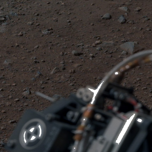
The white areas are pratically clipped: RGB luminosity is above 250.
The image on the right shows a Threshold adjustment layer set to 250 at 50% Opacity in action. As you may see, there are several areas very close to clipping. The problem is that such areas, with the possible exception of the one marked as #1 in the original, certainly carried significant information on color, because it is very easy to check that their color is constantly a greenish yellow, like the points we examined a while ago. Why is then #1 substantially neutral in the original? The only explanation I have is that it could be a specular reflection, while all the other light areas are more opaque. In the original Info Palette, sampler #1 reads 87L(2)a1b, whereas #2 reads 83L(8)a18b: can you believe this? I can’t. I can’t believe that two areas separated by only four points in lightness can show a chromatic shift of six points in the a channel and no less than seventeen points in the b channel. I can’t believe it when I have very good reasons to think that both these are neutral. Even if one of them weren’t neutral, in fact, my conclusion would remain valid nevertheless: the point marked as #1 is simply non-significant. An alternate way to express this concept is the following: I have four points with different lightness, and I have no reason to think they aren’t neutral. I check, and find that one of them is neutral, wheras the other three are greenish yellow. Which one of do you think is the odd alien out?
In order to evaluate the white-balanced version by NASA, though, we must go back to the original article: “The second version, linked to the main version, shows the colors modified as if the scene were transported to Earth and illuminated by terrestrial sunlight.” To me, the part in italic is not convincing. I don’t want to be in any way offensive towards NASA, but this statement is nonsensical. The concept is badly exposed, to say the least. Let’s see why.
Do we know the average color temperature of martian light? I don’t. I’ve hunted the web high and low but haven’t found proper numbers. Yet I can consider the following: the atmosphere on Mars contains very little oxygen and a lot of carbon dioxide. One of the effects of the presence of oxygen in our atmosphere is that the intensity of ultraviolet light is reduced. I therefore expect that an atmosphere with little oxygen may allow a bluish light. There is also an enormous number of dust micrograins in the Mars’ atmosphere. Martian minerals, as was scientifically proven, have a tendency to be red, so the presence of this reddish screen should reduce the blue component favoured by the lack of oxygen. Mars is farther than the Earth from the sun, so the intensity of sunlight is lower than here. Yet in general we don’t expect the color temperature of daylight on Mars to be radically different than ours. I would be surprised to discover that, on the average, it may ither be a lot higher than a terrestrial mountain dawn, or a lot lower than a sunset at sea level. This in turn means that if we were on Mars, our eyes would easily adapt to the color temperature of the planet, and thanks to the phenomenon known as chromatic adaptation we would continue to perceive the objects which look neutral on the Earth as neutrals. It’s the same old game: a sheet of paper appears substantially white under the sun as well as under a tungsten lamp, thanks to the marvellous mechanism which allows our eyes to correct color casts on the fly. Therefore, NASA’s statement is likely to be wrong if we refer it to our visual system: we would see on Mars as we see on the Earth, with good approximation.
What would a camera do instead? It depends on a number of factors. Yet, at least in principle, it is wrong to take the data captured by a normal sensor based on a Bayer filter in a light of whatever color temperature and force a “terrestrial” white balance – something that NASA’s sentence seems to imply. We should have a color checker, or something similar, and try to set a neutral point with it; and, to be honest, an article by dpreview states that something very similar to a color checker is present. In this particular image, though, something went obviously wrong: we know that the metals we see are neutral; and we know that our vision, on Mars, would continue to see them as such in the likely light conditions we expect. I can therefore declare that the most likely version of the photograph shown in this article is neither the original (too greenish yellow), nor the one in which NASA claims to have balanced the white (too blue), but the following:
My version of the original image.
The only thing I’ve assumed is the neutrality of the part of the Curiosity Rover visibile in the lower right angle. Not every point reads a = 0 and b = 0, but certainly the metals are more neutral than in either version – the original and the NASA-corrected picture.
At this point – can I swear that the color of the soil is the one we see in my version? Actually, not: I can only guarantee, with reasonable certainty, that neutrals are correct. Tints may exhibit significant shifts, especially in the most saturated areas. But if we really expect that Mars be the red planet, I believe that this version is more believable than both the original (too yellow) and the white-balanced version by NASA (too blue).
To finish, I can’t refrain, obviously: a quick application of the PPW, with the mandatory step – in this case – of the Modern Man from Mars. Maybe it won’t be a big reference point, scientifically, but the last picture in this article really conveys the idea of “red planet”, and certainly of the variation introduced by the famous and useful technique developed by Dan Margulis.
In this case, how could the PPW be missing – with its MMM?
Happy space to everyone!
MO
Tags: color, mars, modern man from mars, perception, white point
Trackback from your site.