MakingOf
MOonPHOTOSHOP was a real find. Here’s the story of how it came about.
I was looking for a neat way to turn marcoolivotto.com into a bilingual blog. There had been an attempt in the past but I wasn’t satisfied. I ended up with a few double posts (IT and EN) mixed together.
In my quest for a solution I realized that the best way out would require two separate blogs, possibly on different domains. So I started hunting for a good name.
Almost anything containing “Photoshop” seems to be taken, but I managed to find a good one although it nearly cost me my life. I was driving to school one morning and decided that I could search the web a bit. While driving on the motorway, of course. At some point, the idea of “MO on Photoshop” started to form and I entered “moonphotoshop.com” in the search field of my iPhone to discover that the domain was available. It actually cost me US$12. To be honest, I double checked: I could not quite believe that such a name was still available.
I was so thrilled that an immediate stream of ideas started to flow. Before the lessons started, the first draft of the lettering was drawn in pen on a piece of paper.
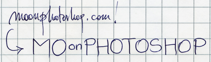
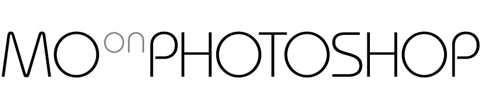
In the afternoon I made a first attempt at lettering Here’s the very first version of the name, made in Adobe Illustrator. The “on” had already migrated to the top. The font is Bauhaus.
I was quite happy that the name contained no less than six round objects in the form of O’s in a total of fifteen letters. More: five big O’s and one small O, like planets and a satellite. The whole idea of the new blog was starting to revolve around the MOon (pun intended). In the usual overkill phase, I tried several refinements, the less ridiculous of which had a thin ellipse around the first O, so that the small O in “on” would look like the MOon orbiting around the Earth. I refrained from this on the basis of a very disciplined consideration: if it’s not clear enough and you have to explain it, then it’s not a good idea; or, at least, it can be expressed better.
That night I sent the draft over to my colleague Marco Campedelli, called Mr. Font by the students, and he thought it was very good. He suggested that I may change the font and handled me a few suggestions, promptly jotted down on the notepad.
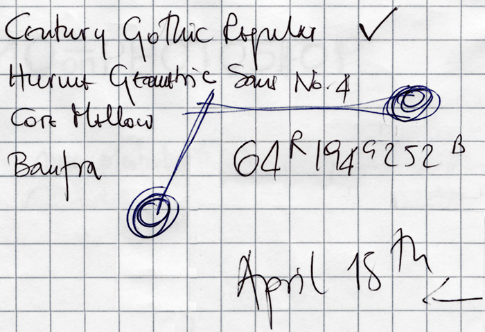
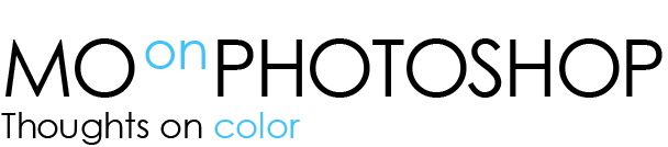
I’d be lost without the notepad, although the only way to describe it is “a mess”. In the figure you may see almost the whole project in its essence: the four suggested fonts (Century Gothic was chosen, in the end), the idea that “on” should be in color and in particular the color of Photoshop CC (64R194G252B in sRGB) and a mysterious launch date: April 15th. This will be explained in a while.
The final lettering came out this way:

At this point, I needed two things: a payoff and a viral kind of hint that the blog would be opening soon. The MOon has a dark side, hasn’t it? So the idea was – don’t let it out. Put it in the graphics but don’t say it out loud. Let people guess.
The payoff came first:
It was not clear at the beginning, where it should be put, but the idea was to make “on color” an internal strong entity of the whole thing. As we’ll see, there was a better idea but it needed time to reveal itself.
Then, suddenly, the viral hook:
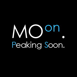
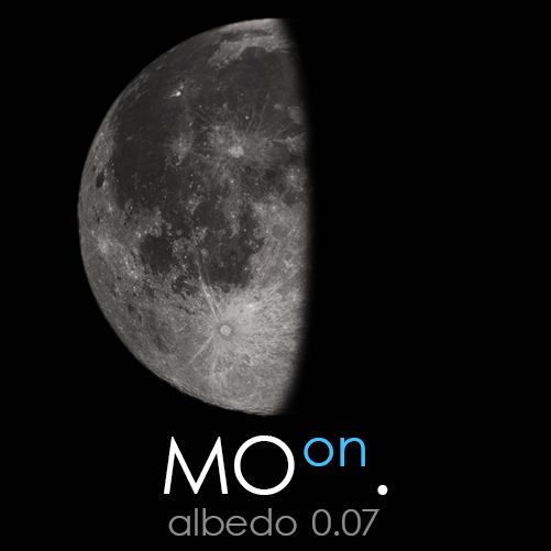
This was the turning point. Concepts shouldn’t be explained, indeed: but the color in the initials, and the initials themselves of the mysterious “Peaking Soon” sentence are a strong hint. And then the dots: definitely a planet and a satellite. This very document gave way to the actual viral campaign to launch the blog, under the name of “Albedo”. Albedo is a number which states how much light is reflected off a certain body. The MOon, in particular, has an albedo of 0.12. The idea was to build a series of twelve lunar phases, with 0.12 being reached in correspondence of a full MOon: April 15th, 2014. The campaign was launched on facebook at the beginning of April. Each post would contain the current albedo and a quote about the MOon taken from a song, as well as the link to the song proper. Here’s one of the twelve images which made up the set:
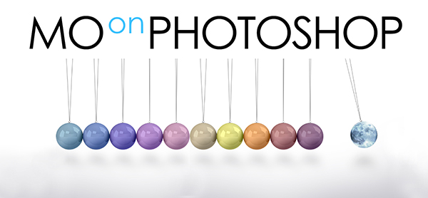
I then needed a header, and turned to two very talented students in my school – Erika and Sofia Feraboli. Over a weekend, I received no less than five totally different projects, ranging from images to illustration, all with a very strong personality. The very first draft of the one which was finally chosen is this:
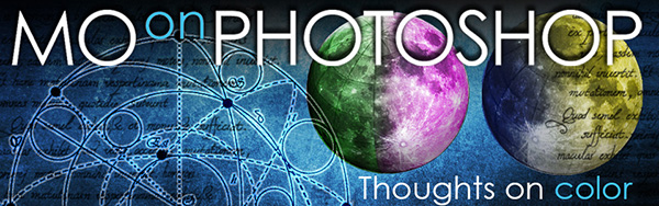
It was too tall, also because no proportions for the layout had been chosen yet, but we stuck to the idea. One of the projects was based about glass spheres which I thought of turning into MOons to have a number of featured images for the articles. Call them visual categories, if you wish. An attempt was made, and I was quite satisfied with it. Then, in the process of putting together the whole lot, I had a casual interaction with Annalisa Di Vito, a graphic designer who attended one of my workshops in Naples, and I thought I’d ask her opinion. Which came, and was very honest: she thought that my set was too complex and too tied to imaging, and suggested that a more graphical approach might be better. I like sincere people, and so I fired – want to have a go at this? It took her five seconds to reply yes, and we established the rule which would constrain her work: “do whatever you want – no limits, and then we’ll discuss what comes out”.
The almost finished set was delivered 24 hours later, to my astonishment. Not only it made sense, but it was coherent and it threatened to bring a very different and yet strong character to the blog. If you’re interested in the process, here’s the first draft of Erika’s and Sonia’s proposal which I rejected as a header, but kept as an idea for icons:
The original set that I had figured out:
![]()
Here’s what Annalisa came up with:
![]()
This set made a striking difference which became a turning point. As it belongs to the realm of design, it has a form and a function. I think the purpose of design is that of making life easier; in this case it should convey a meaning, and I guess it does. At the same time, I know far too well how many tiny fragments of thought enter even an apparently simple work like this. This is apparent simplicity, because while drawing one of these symbols is relatively easy for anyone with some talent in graphics, making a unitary set is a lot more difficult. I’ll let you explore the icons closely, if you wish, to discover the tiny threads that connect each icon to every other. I have a long set of notes, which shall remain hidden, about the process that brought to certain decisions. They shall remain hidden not because they are anything private, but because revealing the substrate may ultimately ruin the appearance. But believe me, everything looks homogeneous and logical because there is a fine line of thought behind the work. And in this sense, I couldn’t honestly hope for anything better. It is also interesting to notice that an alternate version of MOonTHEORY was produced, based on a hint I’d given to Annalisa, but my intended meaning was more confusing than her own. So it was discarded without a tear and it became the only thing we decided to throw away.
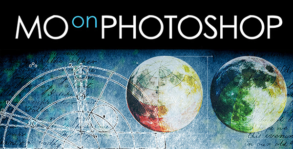
In the meantime, the header had evolved towards this form:
It was absolutely fine, hadn’t it been that the icons were born independently and unexpectedly in the same days this version was being elaborated. Moreover, the layout I had sold as final had been slightly redesigned by me. The final situation was that we had a layout, a header and some icons which worked together but had an efficiency of 80% or so. As a curiosity, it was only when this supposedly final form was delivered that I discovered that Erika and Sonia had drawn the whole thing by hand. Chapeau!
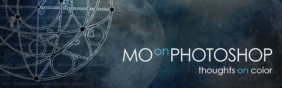
A long final session of editing went on in a curious setting: from a hotel room in Milano, the night before I was due on stage at Creative Pro Show Seven, we had a final go at the thing and hammered everything into place. The joys of the internet are that a team can collaborate without actually ever meeting, as this was the case, over a distance which is often serious. It was a case of “no, move that a bit further down – no, too much – ah, fantastic, but how about the opacity of the writings?” All this, of course, while I was ironing the bejesus out of the CSS, and, at the same time, attending a different chat session to help Davide Barranca (who was having CSS pains as well, that night) debug his own newly airborne website. Add that I was constantly refreshing the blog on my iPhone to check the adaptive design and that, just for fun, we kept on swapping music to keep things going (and ourselves awake) and to try to work in a possibly similar kind of mood. In the end, around 2am, the final header came into life:
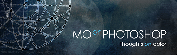
Notice that the tint migrated from “color” to “on”. At some point I thought it would be better this way, and indeed it was. The most logical choice is not necessarily the best one.
All parties involved were happy with the result. It was a case of interaction not based on ego but driven by the wish to reach a good result. Maybe the starting point was somewhat interesting, too: the name, which suggested the lettering, which spawned the astronomic theme, which gave way to the layout, which in turn spawned the header(s), hence my icons, then the new icons which fired back at the header until everything settled into place. No designers were hurt in this process, shall I add.
For me, it was an exhilarating experience and I wrote this page because I think it may be of interest to someone. The bottom line is – one can’t possibly make it 100% alone, no matter how good the starting point is. More ideas and skills are needed, and absolute control is possibly not the keyword. I am deeply grateful for the effort and enthusiasm put in this project by those who participated.
Many thanks to everyone involved!
MO