MO
A short bio
In case you’re interested in a short bio, here it is. I was born in nineteen-sixty-weird, in Italy – where I still live. As I write my age is a perfect square number. I have a degree in physics and I’ve been a music producer for 20+ years. I have a son. For odd reasons I became interested in color correction, went on to study with Dan Margulis and later started to teach it. I currently teach InDesign and Illustrator at Istituto Design Palladio in Verona. Contrary to popular belief, I am a very poor photographer Moreover, I am terrible at writing short bios.
A longer bio

I survived the ’70s, in spite of the shades.
In case you wonder, the cut-up woman in yellow is my mum and the picture was taken in July 1970, when I was more or less as old as my son now. I was never very good at cropping pictures, you see, yet the interesting subject here is the Polaroid camera dangling from my neck, not mum. I’ve been fascinated with photography since when I was a child. My father was an amateur photographer and we had a darkroom at home: one would walk out of the kitchen to find the wooden door on the left, at the top of the corridor. It was a small room with a couple of tables, no windows, and, interestingly enough, it hosted my dad’s stereo as well. For me it was a room of lightness (and darkness) and music.
The red light, the bittersweet smell of the paper developer, the long waits in the dark to See It Appear were an imprinting of some kind. I learned photography by exposure (pun intended). Indeed, I kept on taking pictures and developing them, my first attempt at color printing dating back to 1976 when I was 11. All this until 1981 or so, I guess. Then music kicked in.
Music became my day-job after my degree in physics, which I took in 1988. It was a long and winded course: for a couple of years I was a Unix System Manager at a computing centre in the Faculty of Science where I had graduated from. My main field of action was programming, 3D computer graphics (ah, those Silicon Graphics monsters, and the first NeXT models!) and I would occasionally teach students about these subjects. I left in 1992 when I realised it quite wasn’t my cup of tea: what I really wanted to do at the time was survive on my own music. The practicalities of keeping a band together and the curious paths which would lead (or not) to The Market turned this dream into a failure. To an extent, though: I refrained from writing and performing my own music but I started producing for others – and I do that still.
Music production caused a spin-off: we needed to release CDs and, later, DVDs when we stepped into the world of video as well. Both CDs and DVDs have paper inserts which need to be designed and printed. For a while we dealt with a few graphics studios, and we soon learned that the really difficult part would begin when the ink hit the paper. It was awkward to have a client approving a certain layout on a monitor and then give him something which often would look painfully different. Curious by nature, I started asking around where the problem lay. I discovered that there were no answers; or, better, that anyone having an answer was quite prone to keeping it for themselves.
Things didn’t improve when started hiring in-house graphic designers. These people all had taken regular courses at school, often with very excellent results, but they didn’t seem to know more than I did about commercial printing. Final results were unstable to say the least, and the margin of variation was huge. I was absolutely determined to get to the bottom of the barrel and find a way out.
This lasted… well, you may laugh, but I’d say it lasted from 1995 to 2007, with alternate results. On October 12th 2007, though, I was in London. I remember, because it was the day after my mother’s 67th birthday, and my gift to her had been a trip to England. That morning we walked in to Foyles in Charing Cross Road and I paid a visit to the graphics department. A book titled “Professional Photoshop 5th Edition” by a certain Dan Margulis was seemingly waiting for me on a shelf. I started browsing and decided that it looked interesting. Most of all, it looked different than any other Photoshop books I had, and I had quite a few because I had started working with the program back in 1999, so I wasn’t exactly new to the subject. The author’s approach seemed interesting, to say the least.
The guillotine fell on my VISA just before I walked out with that book and a bag of others which also looked interesting. On the very same evening I went back to my hotel after a long day out dragging bookstore bags with me, and as I laid down to relax I picked Margulis’ book to see what it was about. At 4am I was still reading: I couldn’t quite believe what he was writing, and I thought – either he’s a genius or he’s completely insane. It didn’t dawn on me that a mix of the two things is quite possible, and even likely. Dan Margulis is a completely insane genius, that is. His approach to color, especially, CMYK, is based on making sense of what happens, without confusing the reader with excessive theory, and taking into account something that is often overlooked: the vagaries of the production process and the complexity of perception.
I love England, and London in particular, but I was anxious to go back home and lay my hands on Photoshop to try a few things out. On the very day of my return, a new designer was hired in my company. This girl was brilliant, and she had about a week to get into the job she was supposed to do. In the meantime I kept on studying color correction, with stunning results. In a delirious moment of hybris, as soon as I had finished the book (which meant about a week after my return) I asked her: “what do you know about color correction?” “Nothing”, was her reply. “OK. I’ll teach you.” I sat down and started going through the book again from scratch with her.
About two weeks later we received an old yellowish printed picture faded by the years. The girl scanned it, had a go at it with a set of curves and came up to me saying: “do you think this looks good?” Boy, it did. It damned did. I was so happy of what I was seeing that I made a .jpg file of the two versions and sent both to Dan Margulis. I had never heard from him and of course he had no idea who I was, but I e-mailed him saying – well, this is what we do, and this is what my employee made after a couple of weeks since she started to learn the subject, from me, who ignored it until a week before. It was a “heartfelt thank you” letter.
This happened sometime around the beginning of November 2007. At Christmas I was away for a few days and I got back just to find my mailbox (the Earthly, old mailbox I mean) exploding. Among well-known greeting cards and ads, I found one from the USA. I was wondering who might be writing from the States, and I was astonished when I saw Dan Margulis’ signature at the bottom. Even more when I noticed he had written in perfect Italian.
A few weeks later I got an e-mail. He announced he would be coming to Italy in a couple of months, and that we might meet if I liked the idea. I was incredibly surprised, but I wouldn’t miss the opportunity. My son was born at the beginning of March and that was a serious change in life, of course. But I managed to cut out an evening to drive among the beautiful Dolomites, not too far from my region, with my employee who had, of course, become addicted to color correction.
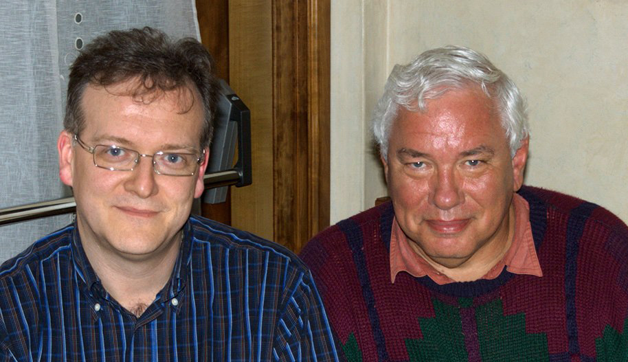
I and Dan in May 2008.
This picture shows us after that dinner. It is cropped, but in the original there is a set of paper towels on the table: I received my first lesson in PPW, the Picture Postcard Workflow, on such towels. At some point Dan said that a new video would soon be released on Kelby Training and that it was about a new workflow he had devised, called PPW. Inquiring minds want to know, so he started to draw a quick scheme on the first piece of paper he was able to find. At a point he said: “well, and at this point… on certain images… if you really want to boost color later you must take a leap of faith and move the image to a false-profile, dull CMYK.” A seriously insane genius, I told you. Dan was already thinking about the Helmholtz-Kohlrausch effect, and the most straightforward way he had found to emulate it was to choke already dull colors even more by moving the image into a colorspace which would not be a very good choice for any kind of printing conditions.
Days later, the Kelby Training course appeared and I watched it avidly. PPW was a really new point of view on everything I had learned up to that point. My first attempts yielded objectionable results, but the power had been unleashed – although PPW was quite different then than it is now.
Even before I met Dan, I was determined to fly to the States and take a course with him. On the evening we met, I was told that the chance that a course would be organized in Italy was rather high, and he dropped the name of Alessandro Bernardi. Alessandro had attended both levels (Applied Color Theory and Advanced Apply Color Theory) of Dan’s class in the States, plus an additional super-advanced class which happened only twice in history. I got in touch with him and ended up on the waiting list, along with my collaborator.
The first Italian ACT class happened in 2009 in Corciano, Umbria. In that occasion I met three people which would later shape my professional life: Davide Barranca, Daniele Di Stanio and Tiziano Fruet. It would be difficult to deny that the original core around which a number of things regarding color correction in Photoshop would revolve in the next few years was formed over those three days. Two more friends, who attended the ACT next year, jumped later on the bandwagon: Giuliana Abbiati and Marco Diodato. Alessandro Bernardi was of course always there, as he was the organizer of the Italian classes which kept on attracting people’s attention also because the former students would often step out to promote and recommend the experience by talking about color correction – a discipline which was largely ignored in our country.
Come 2011, the first Italian AACT was held. The six of us were there, for the first time together in a class. It was supposed to be the last advanced classes ever, although one followed the next year, so it was an intense experience for many reasons. As I was attending, I already knew that I would find myself teaching the same subject in a month or so, because the first of my CCC’s (Color Correction Campus) had been scheduled in Pescara in mid-March. At that point I hadn’t done much: a couple of free tutorials for a community led by Daniele Di Stanio, and three courses for Teacher-in-a-Box, arguably the most visible company devoted to online education in the field of the graphic arts in Italy.
My first class was more an accident than anything else. Francesco Marzoli, whom I had met at an Adobe meeting a few months before, called me and asked me whether I was available to teach him some color correction. I suggested that a small group of people would be better than one-to-one, and about 48 hours later he had decided to try and organize a class. The true problem in these cases is to convince people to attend, but for some mysterious reasons all the available seats were sold in a few days. It was a memorable experience.
My first thought after the two-day intensive full immersion was more or less: “fine, I’ve done it and it’s been interesting – but now, back to my regular life.” Antonio Pesacane, from Naples, was one of the professionals who attended. He created the CCC – Color Correction Campus group on facebook for the students of that class “just to keep in touch”. In the beginning there were indeed a dozen folks. It’s unbelievable that it has reached 1,500 subscribers as I write, but that’s what happened. Antonio Pesacane insisted that I should repeat the CCC experience in Naples and organized one. Then a friend of mine who had heard about it called me and offered a solution in Vicenza. Bologna started to be discussed, and another student organized Ostuni, in Puglia, that autumn. Rome finally came, and things started to roll.
It became a self-feeding mechanism: the large majority of my early courses were organized as no-profit ventures by students who had touched the thing with their own hand and wanted to bring the same experience to their own towns or cities. It was astonishing at the time and it sometimes still is, but I never, ever looked for a course: it was just that Pescara started it all and it went on from there.
To cut a long story short, my relationship with Teacher-in-a-Box continues to this day and has spawned about 40 hours of courses on color correction in Photoshop and connected subjects in three years. Classes and workshops continued and still keep going in spite of the dreadful economy. Late in 2013 I started teaching InDesign and Illustrator in the prestigious Istituto Design Palladio in Verona, and some color correction sneaked in there as well. In May 2014, and that’s one of the reasons why I decided to translate the original blog, I will be speaking about the subject outside Italy for the first time, after an invitation by FESPA in their large exhibition in Munich.
My approach to teaching is simple: never be afraid to communicate what you know; don’t attempt to look brilliant in what you don’t know; keep a scientific approach but tone it down to make it simple to understand, and don’t underestimate the fact that good theories can describe reality, but reality fluctuates enough to defy theories, most of the time. Most of all, never be afraid to state that something is wrong or ill-stated when it truly is.
This is the spirit that pervades the original marcoolivotto.com blog and I intend to transfer it into this one as well. I hope you enjoy reading the articles and, of course, discuss them if you like.
Thanks for reading up to here!
MO